OT Kids
Company Name: Occupational Therapy Kids
My Role: Branding
Who is OT Kids?
OT Kids is a small occupational therapy practice that specialises in treament of young children. Among other things, the practice focuses on developmental delays, learning difficulties and sensory integration difficulties in children.
The brief
Create a brand and identity for OT Kids that will communicate with both parents and kids.
The Solution
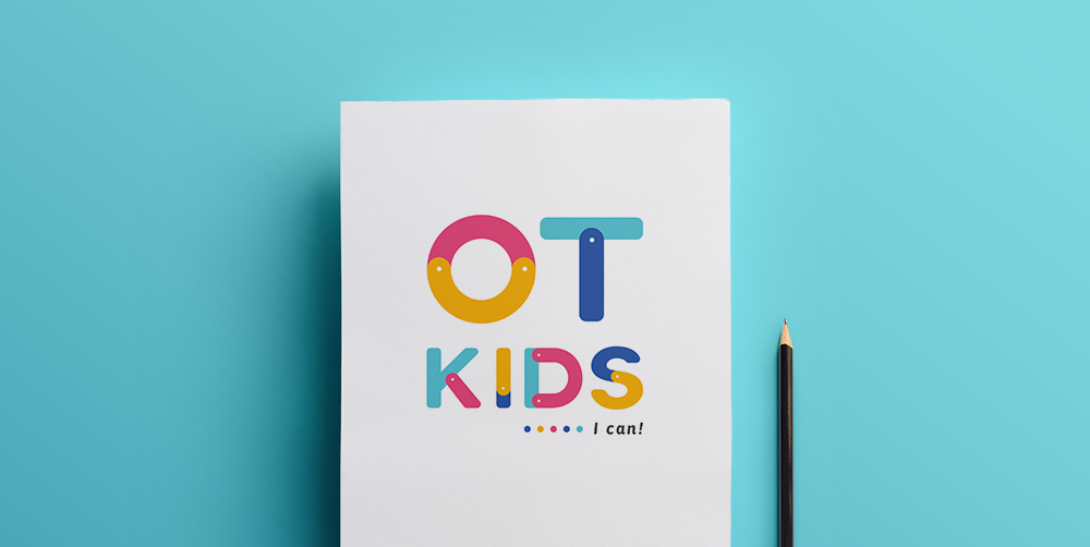
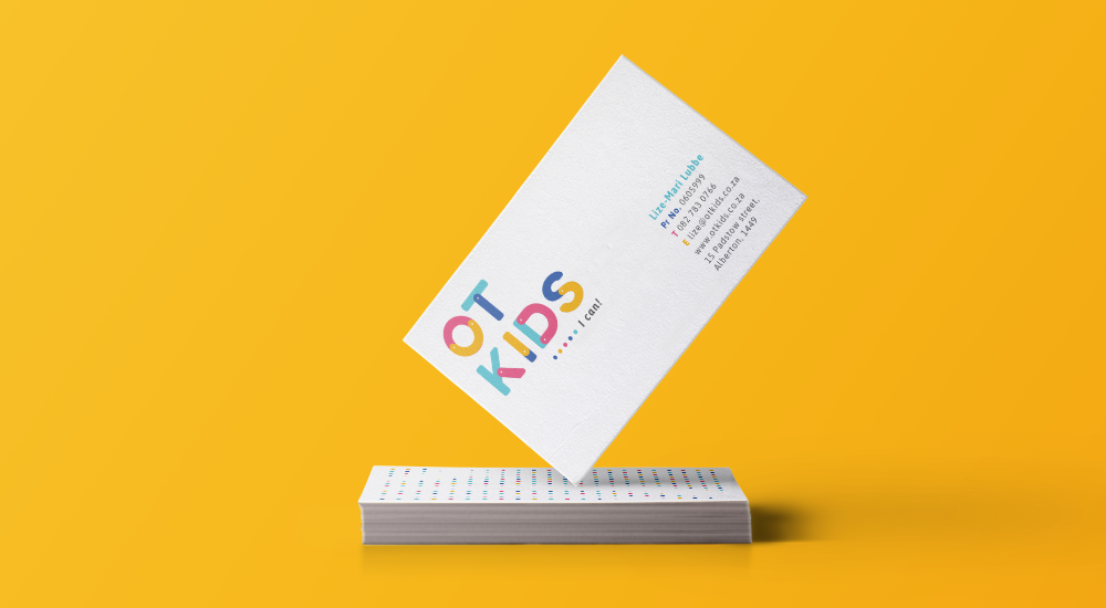
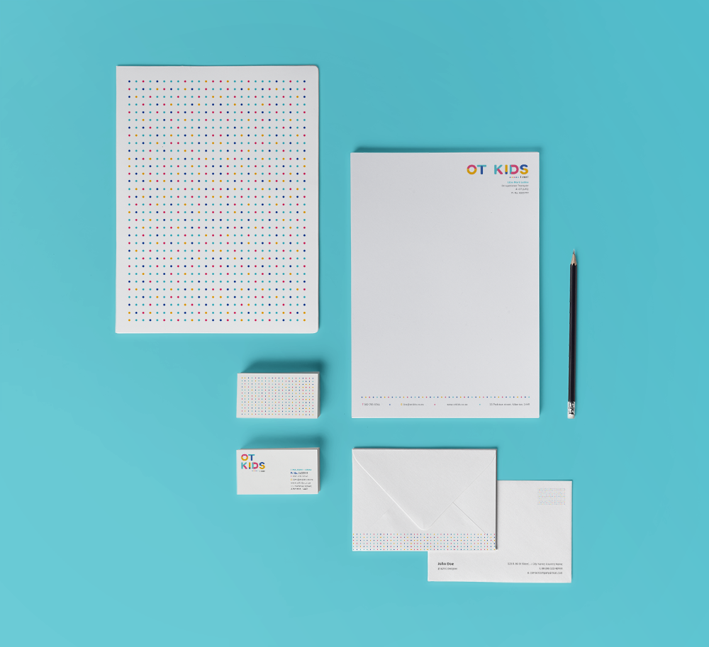
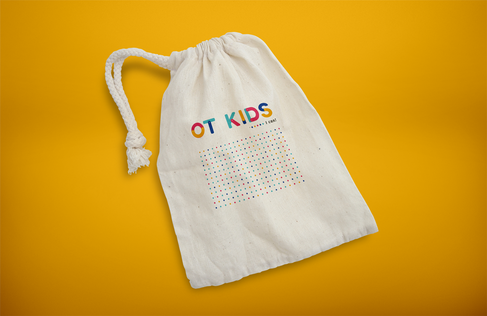
OT Kids’ main channel for developing and helping children is through playing with them. The visual solution that I strategised is an identity that echos the “connect the dot” idea.
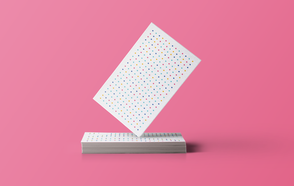
The dots communicate a visual texture to represent the sensory activities that OT Kids therapists have with their patients while also reflecting the “connect the dot” learnings that patients are taught in their real life activities.
Final thoughts
I absolutely loved working on this project and I think it shows. Lize, from OT Kids allowed me to do my thing without becoming overly involved in the design solution. While it is good to get client feedback throughout the design process, it is also refreshing to have creative freedom as a designer with clients who trust in your ability to design effective solutions to their briefs.
Tools used: Adobe Illustrator

